Block’d is just 5 short days away, I can hardly believe it! In today’s post, we’ll be talking about the overall aesthetics and art that went into Block’d.
Let me tell you, the meh, the bad and the ugly sums up how development for the aesthetic went, and to be perfectly honest, I’m still not 100% happy with it.
I am by no means an artist. Sometimes I manage to pull off some decent stuff, but I just could not wrap my head around what I wanted Block’d to look like. I believe that anybody could agree, you need a starting point, so I looked to some of the popular puzzle/strategy games at the time. 2048 and Threes are the two that I want to talk about, since they are so similar in play style, but so different in aesthetics. Both are massively popular and successful due to their easy to learn, difficult to master play styles, which I felt like summed up Block’d as well. However, look at their aesthetics:
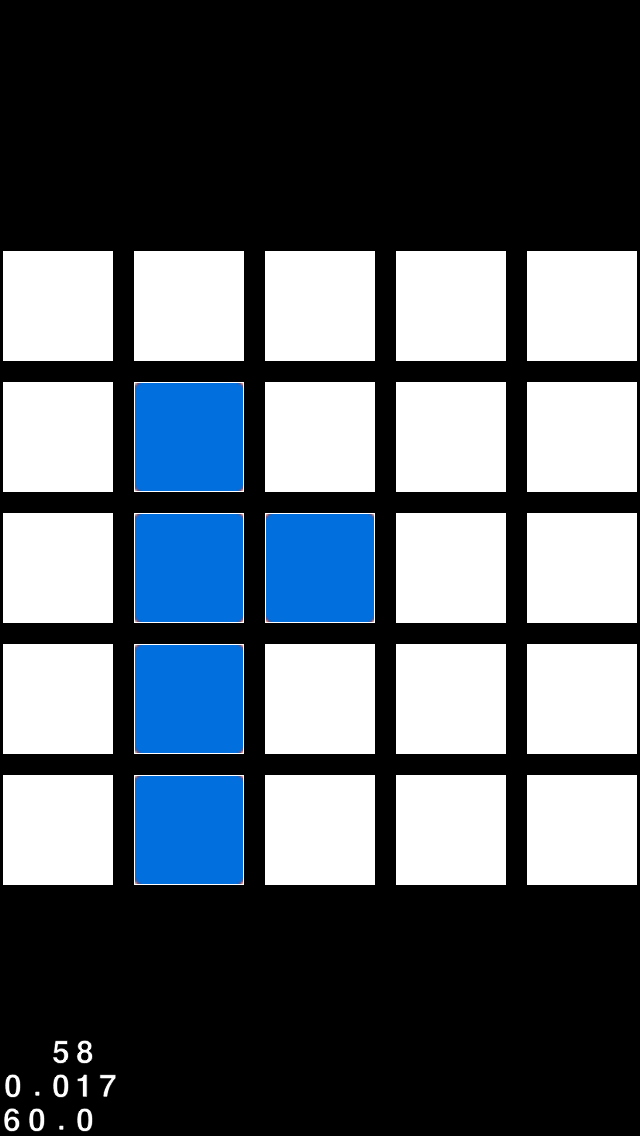
2048 is all simple tiles, whereas threes has some unique little adorable faces. Two ends of the spectrum, which was I to choose? Due to my limitations, I went with the simplistic approach. But it took a while to get there:


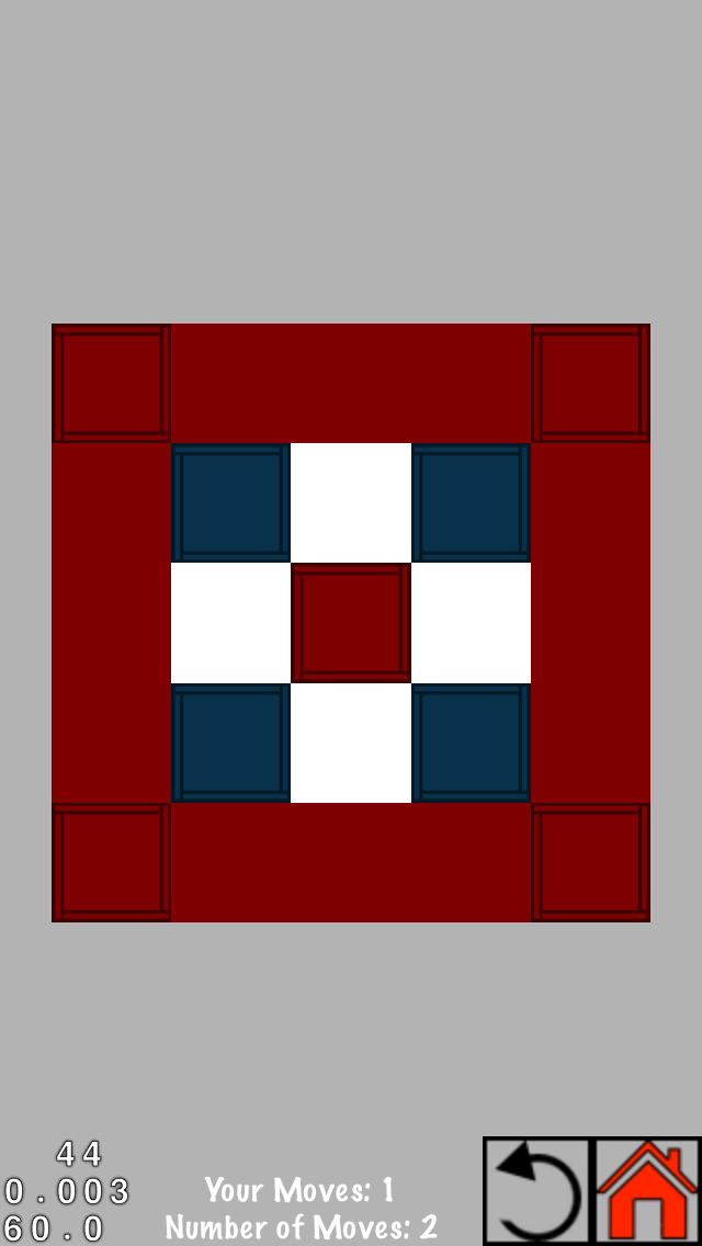


Eventually it got to a point that I was at least moderately happy with, and from there, it was just a matter of creating an overall feel that went with the design for the game screen. All the buttons, all the in between screen followed the same basic patterns and colors. In the end, I feel like we created a very cohesive game, even if the art is not the best. Seeing it live, and on my phone, I frequently find lithe things that I would be happy to change, and that I will over time. But hey, that’s what updates are for.
Hope you enjoyed this! See you in 5 days!
Austin